Hi Everyone,
How is everyone? Thought I'd just do a quick post. I made this card, us for my neighbour Linda's daughter Charlene, who had a little girl on the11th June. Congratulations to you all. Can you guess which digikits I used?
Did you guess? I used the Spellbinders Grand Big Scalloped circle dies to cut the shapes out of contrasting backing papers from the FM New Baby kit. I always use super smooth card for my images and when I make a rocker card I also print the backing papers on the same card, which is 220gsm, to give extra strength.
The largest die is used twice, once in plain white 300gsm card, which is scored in half and folded, to form the rocker base, then again in the patterned paper. The next layer is the third largest, which is then mounted with double sided foam. All the edges were distressed with Tim Holtz spun sugar and faux stitching was added to both layers using a pale pink fine line pen.
There are several images to choose from in the kit, but I thought this one was so cute, especially as Charlene is a new Mum. I can remember when I was a new Mum (just) my baby was never far away from me. I used the crop tool to make some decoupage layers and mounted them with foam pads to add some dimension.
To add the baby's name I used the bunting from FM Playtime. This bunting can be used for any length sentiment, just crop a couple and join them. The letters are also in the digikit. Brooke Anne, what a beautiful name, they were also mounted with foam for dimension. The flowers are from my stash, you can see that tale here. I think I have enough to last my lifetime. I added some glamour dust to the centre of the flowers to add a bit of sparkle.
Some card candy, new baby ribbon in pink and a matching box and the card is done. Charlene and Linda loved it, looks like I may have some new customers, they had no idea I made cards.
I am entering this card into the following challenges:-
Thank you for coming by, do come again.
Love
xx
My papercraft and crochet blog, a place to inspire and share crafty bits.
Showing posts with label Craft Artist Professional. Show all posts
Saturday, 28 June 2014
Thursday, 20 February 2014
Paper piecing and colouring with Craft Artist Professional 2.
Good morning everyone,
Hope you're all well. Been doing something a little different this past few days. About a month ago a free digi stamp was posted on the 'Serif CraftArtist Creative Cappers' Facebook page, with the challenge to have a go at colouring or paper piecing.
Although I consider myself to be quite adept when using CAP2, this was something I'd not attempted. I guess I was the old fashioned, print it or stamp it, then colour it with whichever medium type. Any way, I decided to have a bash and here are the results. This is the naked digi, so to speak.
Now I love a challenge and colouring OR paper piecing was an even bigger challenge to me. I decided to have a go at both. There are some excellent tutorials on the Creative Cappers group page, written by Catherine Carney. They are easy to follow and accessible if you are a group member. It's an excellent group guys', very supportive, why not pop along and have a look. The link is further up.
Here's the finished image. I'm very proud of this, I used gradient effects and shading to make it look more hand coloured. The shawl and patch are paper pieced. Again, all the instruction, by way of a simple, easy to follow tutorial, are on the group page.
I made the digi into a flat, digital card to celebrate Mothers' Day and here it is. Da Da. Can you tell I'm a bit chuffed.
Now, I enjoyed doing the colouring and paper piecing and shall definitely have another go. I also like making the finished card all within CAP2. I do this often. What I do miss sometimes though, is the actual playing with paper and glue. Don't ya just love it, sticky fingers and mess. I digress.
I decided to break the file down and print off the individual elements, to assemble into a card. I wondered if it would be as effective. Here it is, what do you think?
There were a few things I altered slightly. I decoupaged the bear, to give some dimension. The flower didn't work either, it was too fiddly to cut out and much too flat. Also, the fabric buttons. I used card candy in their place. I used a Spellbinder to cut the sentiment out and added some raffia to the spine to finish off, but I did put the faux stitching around the edges.
I enjoyed this project, I just need to upload it onto the group page now. Now there is a warning I'd like to issue before I go. I found this project to be highly ADDICTIVE. So unless you have loads of time to spare, every day, every week, every month, until you stop crafting........ Don't Do It!!!! Just kidding, but don't say you weren't warned. :)
I am entering this card into the following challenges -:
Thanks for coming by and reading my ramblings and do come again.
Bye......
Jools. xxxx
Hope you're all well. Been doing something a little different this past few days. About a month ago a free digi stamp was posted on the 'Serif CraftArtist Creative Cappers' Facebook page, with the challenge to have a go at colouring or paper piecing.
Although I consider myself to be quite adept when using CAP2, this was something I'd not attempted. I guess I was the old fashioned, print it or stamp it, then colour it with whichever medium type. Any way, I decided to have a bash and here are the results. This is the naked digi, so to speak.
Now I love a challenge and colouring OR paper piecing was an even bigger challenge to me. I decided to have a go at both. There are some excellent tutorials on the Creative Cappers group page, written by Catherine Carney. They are easy to follow and accessible if you are a group member. It's an excellent group guys', very supportive, why not pop along and have a look. The link is further up.
Here's the finished image. I'm very proud of this, I used gradient effects and shading to make it look more hand coloured. The shawl and patch are paper pieced. Again, all the instruction, by way of a simple, easy to follow tutorial, are on the group page.
I made the digi into a flat, digital card to celebrate Mothers' Day and here it is. Da Da. Can you tell I'm a bit chuffed.
Now, I enjoyed doing the colouring and paper piecing and shall definitely have another go. I also like making the finished card all within CAP2. I do this often. What I do miss sometimes though, is the actual playing with paper and glue. Don't ya just love it, sticky fingers and mess. I digress.
I decided to break the file down and print off the individual elements, to assemble into a card. I wondered if it would be as effective. Here it is, what do you think?
There were a few things I altered slightly. I decoupaged the bear, to give some dimension. The flower didn't work either, it was too fiddly to cut out and much too flat. Also, the fabric buttons. I used card candy in their place. I used a Spellbinder to cut the sentiment out and added some raffia to the spine to finish off, but I did put the faux stitching around the edges.
I enjoyed this project, I just need to upload it onto the group page now. Now there is a warning I'd like to issue before I go. I found this project to be highly ADDICTIVE. So unless you have loads of time to spare, every day, every week, every month, until you stop crafting........ Don't Do It!!!! Just kidding, but don't say you weren't warned. :)
I am entering this card into the following challenges -:
Papertake Weekly Challenge - Lovely layers.
Craft-room Challenge - Colour challenge.
Ladybug Crafts Ink TLT Challenge - Flowers galore.
Thanks for coming by and reading my ramblings and do come again.
Bye......
Jools. xxxx
Wednesday, 30 October 2013
Silver Wedding Anniversary Card.
Hi Guys',
A good morning to my fellow bloggers, from a beautiful sunny Spalding, cold, but beautiful. Thought I'd share one of my several silver wedding anniversary cards that I've made in the past couple of months. Did something relevant happen in 1988, or is it just that my friends are of that age group where they're all celebrating their silver wedding? I think it may be the latter.
Todays card was for one of the girls at work, to give to her loving husband. The brief was to incorporate some kind of invitation for the special trip she'd planned as his present.
The card was designed in CAP2 in neutral cream, black and grey, to make the card more masculine. The backing paper is a simple broiderie type design, in cream and grey and to add that special touch, I stamped 25 randomly all over it. For the greeting I made a tag with calligraphy type text, in keeping with the wedding theme. I added shadows to give the appearance of depth and finished it off with a heart embellishment. It was then attached to the card with black and silver ribbon.
The invite part was the most troublesome, so I decided to make another tag and put it into a pocket.
To finish, I added some decorative cut-outs, using the same design as the backing paper, with some black card candy for extra detail.
I boxed the card, again using the same design as the backing paper.
Hope you like it and thanks for popping by.
I am entering this card into the following challenges :-
See you soon.
Jools. xx
A good morning to my fellow bloggers, from a beautiful sunny Spalding, cold, but beautiful. Thought I'd share one of my several silver wedding anniversary cards that I've made in the past couple of months. Did something relevant happen in 1988, or is it just that my friends are of that age group where they're all celebrating their silver wedding? I think it may be the latter.
Todays card was for one of the girls at work, to give to her loving husband. The brief was to incorporate some kind of invitation for the special trip she'd planned as his present.
The card was designed in CAP2 in neutral cream, black and grey, to make the card more masculine. The backing paper is a simple broiderie type design, in cream and grey and to add that special touch, I stamped 25 randomly all over it. For the greeting I made a tag with calligraphy type text, in keeping with the wedding theme. I added shadows to give the appearance of depth and finished it off with a heart embellishment. It was then attached to the card with black and silver ribbon.
The invite part was the most troublesome, so I decided to make another tag and put it into a pocket.
To finish, I added some decorative cut-outs, using the same design as the backing paper, with some black card candy for extra detail.
I boxed the card, again using the same design as the backing paper.
Hope you like it and thanks for popping by.
I am entering this card into the following challenges :-
See you soon.
Jools. xx
Saturday, 28 September 2013
Kraft Typography 'Welcome to your new home'.
Good morning from a sunny Spalding,
I'm hoping the weather holds until the 2nd, as I'm going away in my camper for a week. Now I really don't mind it being a bit cooler, seasoned camper now, ;) but I do prefer sun to rain. Anyway, thought I'd update my blog while I have time.
Today's card is still with the typography style, but also in the Kraft style too. I love both themes at the moment and needless to say, most of my cards seem to be following this theme.
My brief for this card was to do pretty much anything, so thought I'd give it a rustic feel. I designed the card in CA2 and utilised various letter styles from numerous digikits, but the images and backing papers are from the 'Shabby shed' digikit. I love the shabby shic feel to it, really lends itself to the kraft theme. The topper itself is flat, no decoupage, just shadows. I'm always a bit in awe as to the 3D and shadow effect you can create on CA2, they're so realistic.
The edges of all the layers were distressed with Tim Holtz antique linen and I used raffia instead of ribbon, in keeping with the garden and kraft theme.
To finish I added some card candy and made a matching box. Hope you like it, my friend certainly did.
I am entering this card in the following challenges:-
Thanks for popping by, see you soon.
Jools. xx
I'm hoping the weather holds until the 2nd, as I'm going away in my camper for a week. Now I really don't mind it being a bit cooler, seasoned camper now, ;) but I do prefer sun to rain. Anyway, thought I'd update my blog while I have time.
Today's card is still with the typography style, but also in the Kraft style too. I love both themes at the moment and needless to say, most of my cards seem to be following this theme.
My brief for this card was to do pretty much anything, so thought I'd give it a rustic feel. I designed the card in CA2 and utilised various letter styles from numerous digikits, but the images and backing papers are from the 'Shabby shed' digikit. I love the shabby shic feel to it, really lends itself to the kraft theme. The topper itself is flat, no decoupage, just shadows. I'm always a bit in awe as to the 3D and shadow effect you can create on CA2, they're so realistic.
The edges of all the layers were distressed with Tim Holtz antique linen and I used raffia instead of ribbon, in keeping with the garden and kraft theme.
To finish I added some card candy and made a matching box. Hope you like it, my friend certainly did.
I am entering this card in the following challenges:-
Joanna Sheen Challenge - Coffee and cream.
Allsorts Challenge Blog - How does your garden grow?
Crafts 4 Eternity - Anything goes.
Thanks for popping by, see you soon.
Jools. xx
Saturday, 8 September 2012
Birthday Scrabble card.
Hello fellow bloggers,
A very quick post today, but this card has to be one of my favourites for ages. It is so simple, yet so effective.
I'm afraid I can't take the credit for this concept, I saw a similar card on Barbar Grays classroom last week. It was an example for the stamp set for the next class. I don't have the stamp set, which is letters and blocks. So I improvised.
I used Craft Artistist for the tiles. First I had to map out what letters I needed, then I found a very plain frame with a black outline, added plain, block type letters, as in the scrabble game, and added a beige background. The worst bit was cutting them all out.
The background paper is the same one I used for the tiles, I just made it more transparent so it was paler. I distressed around the card with Tim Holtz antique linen, added some card candy and a nice insert, and it was done.
Happy to say that my son-in-law loved it.
I am entering this card into the following challenges:-
Papertake Weekly Challenge - Anything goes.
My Mums Craft Shop Challenge - Anything goes.
Inky impressions - Anything goes.
Creative Craft Challenges - All about the boys.
A Gem of a Challenge - A boy thing.
ABC Challenge - W for wishes.
Heck of a Challenge - Anything goes.
Thank you for taking the trouble to pop by, do come again.
Jools. xxx
Tuesday, 19 June 2012
Humorous Male 70th Birthday Card with Craft Artist Professional.
Hello everone,
My Mum asked me to do a card for her friend's 70th birthday. I asked if he liked golf, football, gardening, fishing, the answer to all was no. So what do you make a male ( you know my phobia by now ) who seems to like NOTHING?
There is one thing I do know about him, he has a wicked sense of humour, so there was the answer. So here is the card I decided to do.
It's a one layer card, designed in Craft Artist Professional and printed on photo paper. I love the finished article, it's hard to believe it's flat isn't it. That's the clever program, it allows you to add shadows to everything. All the embellishments are from various digi kits. I think the pegs are great, it really looks like the topper is hung up. I couldn't resist putting some ink blots and coffee cup stains on. It makes it look really blokey.
A happy birthday and a 70 in red and it's done. I hope he likes it and isn't offended.
Thanks for stopping by my blog and do come again.
Jools. xxx
My Mum asked me to do a card for her friend's 70th birthday. I asked if he liked golf, football, gardening, fishing, the answer to all was no. So what do you make a male ( you know my phobia by now ) who seems to like NOTHING?
There is one thing I do know about him, he has a wicked sense of humour, so there was the answer. So here is the card I decided to do.
It's a one layer card, designed in Craft Artist Professional and printed on photo paper. I love the finished article, it's hard to believe it's flat isn't it. That's the clever program, it allows you to add shadows to everything. All the embellishments are from various digi kits. I think the pegs are great, it really looks like the topper is hung up. I couldn't resist putting some ink blots and coffee cup stains on. It makes it look really blokey.
A happy birthday and a 70 in red and it's done. I hope he likes it and isn't offended.
Thanks for stopping by my blog and do come again.
Jools. xxx
Friday, 8 June 2012
Happy Birthday Easel Card with Tilda.
Good afternoon bloggers,
Hope you like it, have a nice crafty afternoon and thanks for stopping by.
Jools. xxx
This weather has one positive side to it, I'm making plenty of stock for my stall at the craft fairs. Today's card was inspired by the Fab n Funky challenge, 'Go Green'. I would never have thought to do a green card, but I love it now. Anyway, back to todays card.
I used another one of my new Tilda images, with a bit of a twist. I coloured her with promarkers first, then decided to dress her in a pretty frock, with matching bow and shoes. The paper I used was basically green with a tinge of orange(s), it's a CraftArtist backing paper from their 'Summer fun' digikit. I just stamped the image onto the paper and cut out the bits I needed, then stuck them in place with zig glue. I think she looks so sweet. It's by no means a new technique, but it's new to me.
I used a basic scalloped 6x6 card for the easel and spellbinder grand large scalloped die for the main mats and layers. Tilda is mounted with foam onto a doilie, which I cut with my cricut and an SVG file. This was then matted onto a dotty backing paper circle.
All the flowers are my hand made stash ones, but I scrunched them up and layered them today. That was a bit hard to do, my style isn't really grungy, but I must admit, I do like them. The swirls are made using my spellbinder floral flourishes dies and the sentiments are Hunkidory. A bow, using ribbon from my stash, and it's finished.
I'm entering this card into the following challenges:-
Fab N Funky Challenge - Go green.
I Love Promarkers - For a little girl.
The Official Magnolia Inspiration Challenge - Anything goes.
Midweek Magnolias - Anything goes.
Just Magnolia - Anything goes
Hope you like it, have a nice crafty afternoon and thanks for stopping by.
Jools. xxx
Thursday, 10 May 2012
Tilda say's 'just for you' so charmingly in orange.
Hi buddies and bloggers,
I am entering this card into the following challenges :-
Thanks for dropping by and do come again soon.
Bye......
Jools. xxxxx
Is it afternoon already? Amazing how time flies when you're having fun. Getting a few girly cards in before I have to do BOY ones again. ( 2 more, ahhh ) Today's card is similar to a rocker but isn't!! It's one of my new spellbinder shapes that I bought last week and haven't got round to playing with yet. I got to use one of my multiple coloured Tilda's from a few weeks ago too.
The die is Grand Labels Eleven. I used the largest size to make a landsacape card with a piece of white A3 card. None of my card blanks were big enough, even the 8x8 ones. The rest of the dies I used in portrait. The backing paper is from the Craftartist spring in your step digikit. There are some beautiful papers in the digikits and the thing I love about Craftartist is that you can choose which colours you want, without having to troll through every single backing paper. I printed this mat on supersmooth 220gsm, because it's at the back and needs to support the rest of the layers. The smallest mat is textured white card, distressed with Tim Holtz shabby shutters and then matted onto core'dinations just peachy.
I made the flowers with the spellbinder daisy topper die using both the backing paper and just peachy card. The centres are material covered button brads from my stash. The floral flourishes were made in the same cards and two pearl hat pins were placed in between the layers, to hide the sharp points. Tilda was coloured with promarkers.
To add the finishing touch, I used some peach ribbon with a faux bow and threaded an orange craftime charm onto some jump rings, which I put through the knot.
I haven't made a support bar with this card, I'm not sure if it needs one. It seems more stable than the rocker cards, but the jury is still out on that one. I was left a comment on one of my posts about my liberal glittering and it made me smile. Yes, I own up, I am a liberal glitterer, all over the card, me, my craft table, the floor, the whole house.........
I am entering this card into the following challenges :-
Ladybugs Craft Ink TLT Challenge - Anything but square.
I Love Promarkers Challenge Blog - Hat pins and charms.
The ABC Challenge - O for orange.
Joanna Sheens Challenge Blog - Flower power.
Fab 'N' Funky - Buttons and bows.
Thanks for dropping by and do come again soon.
Bye......
Jools. xxxxx
Monday, 7 May 2012
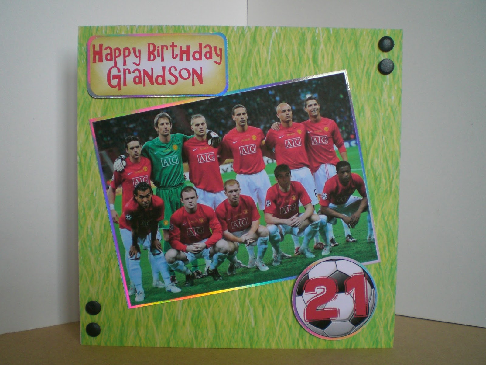
Football birthday cards for big boy's.
Hi everyone,
My sis just turned up, she loves it and says Ricky will too. Phew, that's a relief.
Thanks for coming by, see you soon.
Jools. xxx
Well, that's two down and two to go. Don't you just love BOY cards. It's either football, golf, motorbikes or cars . Such variety. In this instance it happens to be football, or to be more precise, Manchester Utd. It's my great nephew's 21st birthday, my sister's Grandson, so they were the two cards I had to make. I'm quite happy with the results ( but can't wait to get back to my glitter and glitz)
Here's the card I made for me to send. I decided to use the Manchester United colours for this one. The backing paper is from MCS and I just tiled 'Happy Birthday' all over it. I printed the same backing paper on 220gsm supersmooth card and made the rosette. The centre is a clipart football mounted onto silver mirricard and the numbers were cut out on my cricut, again in mirricard. A bit of black card candy (had to get some in somewhere) some satin ribbon and a sentiment from cardart to finish.
My sister wanted me to use an actual picture in this next one, with Ricky as part of the team. I did this last year for my Grandson and it was quite effective.
I downloaded a picture of ManU and imported it into Craftartist to work some magic. I was a bit limited with pictures of Ricky, so I settled for this one. He's sticking his tongue out showing off his tongue stud. Him to a tee. There he is, next to Scholes. That's worrying, I know the names?!? I mat and layered onto some holographic card and placed it at a jaunty angle. The background is from the Docraft Woodlands folk and friends. I thought it was quite apt to have grass. Bit of black card candy again, it finishes it off. That's my excuse and I'm sticking to it. Hope he notices himself.
My sis just turned up, she loves it and says Ricky will too. Phew, that's a relief.
Thanks for coming by, see you soon.
Jools. xxx
Thursday, 5 April 2012
Rocker Card, Craft Artist Professional and Cocoa Latte digikit
Hi All,
T.T.F.N.
Jools. xxx
Have been waiting to share this card with you for a couple of weeks now, but couldn't before today. It wouldn't be quite right for my daughter to see her card on my blog before her birthday, would it? Anyway, it's today, so here it is. I love it, it's all chocolaty and lush, mmmmm.
I designed it with my CraftArtist Professional software, using the Cocoa Latte digikit. I've always loved the look of that digikit, but couldn't decide what to do with it, then it came to me. Rocker cards are quite popular at the moment, so I thought I'd do one, or two....... because I couldn't stop there. I liked it so much I decided to make my friend one for her birthday too.
I used a thick heavy card, about 350gsm, for the rocker base. The rest was printed on my trusty supersmooth, 220gsm and Grand Big Scalloped Circles to cut all the shapes. I distressed everything with Tim Holtz Antique Linen, which added to the choccy feeling. All the embellishments are part of the digi kit. I cut the straw out and stuck it through a hole in the card, so it looked like it was in the hot chocolate. The flower I printed twice, one a bit smaller than the other, then layered them and finished it with a cloth covered button. Finally, the tag was fastened to the coffee cup handle using a piece of red ribbon.
To finish the card off I put a circle shaped greeting on the back. The one drawback, if you stand the card on a shiny surface, it collapses. A bit like Bambi on Ice. Small price to pay though, eh? Hope you like them and thanks for dropping by.
I have entered this card into the following challenges:
ABC DT April challenge - anything goes
Simon Says Stamp challenge - My favourite tool, Grand Calibur.
Jools. xxx
Thursday, 22 March 2012
Baby's first birthday wordbook and picture window.
Hi all,
Just finished a first birthday wordbook for one of the girls at work and thought I'd share it with you. Been a few day's since last posting, you can tell I'm back at work. Anyway, it's digitally crafted using Craft Artist Pro. I used CA because my customer wanted loads of pictures to record her baby's first year and I just love the selection of intelligent frames on the digikits available. Here's the book closed, it's quite large, the last page is 5" x 12".
The pages and letters of the wordbook are from the Funky Daze cd, by Funky Hand. I love her work, it's so grungy yet still pretty. I imported the letters into my CA and played around with the colours to make it more suitable for a baby. The embellishments were from various CA digikits, I wanted to add a bit of dimension so it wasn't just a flat word book. The 'I am 1' balloon was glazed with glossy accents just to make it stand out more. Then the fun began. My friend sent me so many pickies I didn't have a clue which to use.
I managed to fit eight photo's in the book, all with different intelligent frames and captions. Hope she likes my choices. It was printed on 220gsm supersmooth card and finished with my Bind-it-all. Didn't have blue so had to use silver. Added loads of ribbon in various colours and a few pompoms and there you have it.
This next one is also a card with a difference, It's a picture window card by My Craft Studio. There are several cd's to choose from, this one is an adaptation of a Crystal Sparkles picture window, with all the illustrations and embellishments from the Young at Heart, 3rd Anniversary cd's.
This style card has proved to be very popular amongst my customers, it's very 3D and also has a kinetic movement. I've made quite a few now, birthday, wedding, anniversary, new baby, etc. There really is no limit, they can be adapted to suit any occasion. Again, I printed onto supersmooth card and added a sentiment from cardart. A bit of glitter round the edges of the animal heads adds that finishing touch. A chocolate box style ribbon on the side and it's done.
Hope you like them, thanks for popping by, gonna go and play with my panpastels, I'll post my efforts another day.
bye....
Jools. x
Just finished a first birthday wordbook for one of the girls at work and thought I'd share it with you. Been a few day's since last posting, you can tell I'm back at work. Anyway, it's digitally crafted using Craft Artist Pro. I used CA because my customer wanted loads of pictures to record her baby's first year and I just love the selection of intelligent frames on the digikits available. Here's the book closed, it's quite large, the last page is 5" x 12".
The pages and letters of the wordbook are from the Funky Daze cd, by Funky Hand. I love her work, it's so grungy yet still pretty. I imported the letters into my CA and played around with the colours to make it more suitable for a baby. The embellishments were from various CA digikits, I wanted to add a bit of dimension so it wasn't just a flat word book. The 'I am 1' balloon was glazed with glossy accents just to make it stand out more. Then the fun began. My friend sent me so many pickies I didn't have a clue which to use.
I managed to fit eight photo's in the book, all with different intelligent frames and captions. Hope she likes my choices. It was printed on 220gsm supersmooth card and finished with my Bind-it-all. Didn't have blue so had to use silver. Added loads of ribbon in various colours and a few pompoms and there you have it.
This next one is also a card with a difference, It's a picture window card by My Craft Studio. There are several cd's to choose from, this one is an adaptation of a Crystal Sparkles picture window, with all the illustrations and embellishments from the Young at Heart, 3rd Anniversary cd's.
This style card has proved to be very popular amongst my customers, it's very 3D and also has a kinetic movement. I've made quite a few now, birthday, wedding, anniversary, new baby, etc. There really is no limit, they can be adapted to suit any occasion. Again, I printed onto supersmooth card and added a sentiment from cardart. A bit of glitter round the edges of the animal heads adds that finishing touch. A chocolate box style ribbon on the side and it's done.
Hope you like them, thanks for popping by, gonna go and play with my panpastels, I'll post my efforts another day.
bye....
Jools. x
Wednesday, 7 March 2012
Christening Invitations, christening easel cards and gift bag.
My crafty pal Sue and me had been playing with hot foiling, so I thought that would be a place to start. I already had a nice selection, one of them being a lovely baby blue, a bit different from silver, perfect.
Once I got going they were quite easy, I didn't want them to be too prissie, Logan being a boy, so I thought a nice image of him in the background would look good. This photie is his Mum's favourite, so it was ideal. I faded it into the background using Craft Artist Professional. The good thing about CA is that you can turn layers on and off. So I printed the background image first on my inkjet printer.
Next came the text. I had to print this on my laser printer to be able to hot foil it. Laser printers use toner instead of ink, and the toner melts during the foiling process, allowing the foil to stick. There are specialist hot foiling machines, but I use my laminator, it does a perfectly good job. This is where the layers function comes in. I needed the background image on the screen, to enable me to put the text in the right place, but before printing I turned the background layer off so only the text would print. Simples. Ha, you'd think! The paper goes face down in the inkjet printer and face up in the laser. Got that muddled a couple of times.
I used spellbinders grand labels 1 for the matting and layering. The inserts were more straightforward, no background, so just the laser printing. Oh, and a bit of blue satin ribbon to finish, you have to have ribbon, even for a boy, don't you?
When it came to designing Logan's Christening card, I thought I'd stay with the same theme and use my toner foil, but silver this time. I did an easel card ( do you see a pattern developing ) shaped like a book. I wanted it to be something nice to keep and I thought a book shaped card would make it feel like the occasion had been recorded for posterity.
Finally, you can't have a posh card without a matching present, so I made a matching gift bag in MCS, their Encyclopaedia of card and papercraft templates had an ideal bag. I have an A3+ printer, so I just printed it bigger, using the same backing paper as the card and box.
A couple of weeks later I had an order placed for a combined Christening /1st birthday card, with the emphasis being on the Christening. I decided to use the same format as for Logan's card, just adjusting and adding to the verse. Oh, and changing the colour, because this one was for a little girl.
What a difference it makes, just changing the colour to pink. My customer loved it, and so did Lois's Mum. That's always nice to know, isn't it?
That's it for now, lunch beckons, thanks for dropping by. TTFN.
Jools. xxx
Monday, 5 March 2012
Mothers' Day Cards.
Good afternoon all. Well, it's that time of year again, 'Mothering Sunday'. It used to be quite simple, but now we have three generations of Mums in my family, so who does the cooking? :) Anyway, thought I'd share the cards I've made this year. There are three designs, one for me, one for my Sis and one for my friend. Two are very pretty and girly and one is more traditional, hope you like them.
This first one is a standard easel card, which I designed in Craft Artist Professional. I used backing papers from the 'Country chic flower' collection by The clipart Fairy. I love her style and use a lot of her papers in my designs.
I made the frame using the punch feature in CA, adding effects to give a cushioned, 3D look, before mounting it with foam tape onto the background. It's a bit fiddly, there are six layers to the frame, all with individual effects, but I'm getting better and it looks really great. A flat photogragh doesn't really do it justice. The daisy and hearts were from the kit, with the the compulsory sprinkling of glitter.. I'm going to have a go at designing my own flowers soon, now that I'm getting the hang of the graghics program. I'll show you my efforts later.
The second card was again a traditional easel ( does it show that I like 'em? ). This one is for my friends Mum. I was told anything with Westies or gardening. I went for westies, because I knew I had exactly the right image on one of my CD's. It definately has the ' ahhh ' cute factor, don't you think?
This first one is a standard easel card, which I designed in Craft Artist Professional. I used backing papers from the 'Country chic flower' collection by The clipart Fairy. I love her style and use a lot of her papers in my designs.
I made the frame using the punch feature in CA, adding effects to give a cushioned, 3D look, before mounting it with foam tape onto the background. It's a bit fiddly, there are six layers to the frame, all with individual effects, but I'm getting better and it looks really great. A flat photogragh doesn't really do it justice. The daisy and hearts were from the kit, with the the compulsory sprinkling of glitter.. I'm going to have a go at designing my own flowers soon, now that I'm getting the hang of the graghics program. I'll show you my efforts later.
The second card was again a traditional easel ( does it show that I like 'em? ). This one is for my friends Mum. I was told anything with Westies or gardening. I went for westies, because I knew I had exactly the right image on one of my CD's. It definately has the ' ahhh ' cute factor, don't you think?
The image is taken from an original painting by an Italian artist called 'Giordano'. Joanna Sheen has produced a couple of CD's using his work. This one is from the 'Puppies & Kittens' cd. Take a look, you won't be dissappointed. I curved the text in MCS and used my spellbinders Grand scalloped circles to cut out the design and mat and layer. Again, my license to glitter was used, also a touch of Tim Holtz spun sugar distress ink, to take off the stark whiteness of the card. It's ok using supersmooth, bright white paper for printing, but it is what it says on the box, bright white. Don't know what I'd do without distressing ink, dazzling a load of folk, I suppose. Does anyone recognise the flowers?
My third card is completely different. My sister ordered this one and chose what she wanted to go on the card. It's about time I started doing something with all my parchment toppers I suppose.
I think this card was the most complicated out of all of the cards. I'ts a big card, 8x8, so a lot of space to fill. I found a great piece of papermania backing paper, which had Mothers' Day plastered all over it, and it was the right colour too, our Mum loves blue. I have loads of pads with backing papers in, but since I've started cd crafting, I rarely look at them. I must make an effort.
The whitework topper was made using the Pergamano multi grid, no14. I really enjoyed doing these toppers, as with the butterflies, you can do them while relaxing at night watching tv. Very therapeutic. But I must remind myself to do something with them! The tulip topper was mounted onto the largest of the spellbinder lacey circles, S4-293. Just the right size. Bit of denim blue distressing and a trail of gems for the butterfly and the card was born. Ahhh....
Well that's all for now, I think I'll go and play at designing some flowers. Or I could have a go at using my guilding flakes that arrived a couple of days ago. I really must stop spending.
Bye................
Jools.
xxxxx
Subscribe to:
Posts (Atom)
.jpg)