Tuesday 27 March 2012

Card Embroidery and Papercrafts with step by step tutorial.

Hello from a gorgeous sunny Lincolnshire.

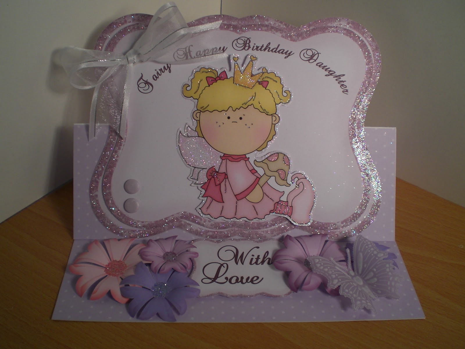
Thought I'd upload something a bit different today. I started doing card embroidery about a year ago and I absolutely love it. I've always loved sewing in some form or another, but never thought for one minute I'd be embroidering onto card. But as you can see, if you use a nice image and pretty colours, the finished cards look great.


All the illustrations I use are from a company called stitching cards. Every occasion you can think of, there will be an illustration. You just purchase, download and print. Easy.


Each pattern comes with full instructions, full colour illustrations, and a pricking template. I do advise that you print in colour, as it makes the guide easier to follow. This is a new one I've downloaded today. I print the instructions on normal copier paper and the pricking template on 220gsm card.


Secure the template onto your chosen card, I usually use one with some texture. The weight can be anything from 120gsm - 250gsm, if you get much thinner the stitching can tear through and if you go thicker the card isn't pliable enough. I use a standard pricking tool, not too fine, and the reverse side of a mouse mat to pierce onto.


You can use any cotton, there are no hard and fast rules. As you can see I have loads, so I won't be running out any time soon. These two boxes were a free gift with a sewing machine I bought a couple of years ago. I forgot I had them. The ones at the back are metallic. This thread can be a bit difficult to sew with. The other thread is polyester, by far the easiest thread to use, and such a wide selection of colours. I always use my threads double, with a blunt embroidery needle. Just make sure it's a smaller size than the pierced holes.


Secure the threads at the back of the work with sticky tape, I use either masking tape or invisible clear tape. It has to be very sticky though, so no low tack tape. It can sometimes look a bit messy but once it's been mat and layered, you can't see it.


Here's a few finished toppers before being made into cards. The top ones are in polyester and the bottom ones in metallic.


Here are some more cards finished. Sunflowers are supposed to be very popular this year, so perhaps I'll need to make some more. They won't be on square mats though, I've added spellbinders  to my crafty stash since first doing these cards, so I'll be embroidering onto different shapes from now on.

Thanks for dropping by, hope this post inspires you to have a go. I feel the need to go out and sit in the sun, and maybe do a bit of embroidery while I'm out there.


Bye...........

Jools. xxx


Thursday 22 March 2012

Baby's first birthday wordbook and picture window.

Hi all,

Just finished a first birthday wordbook for one of the girls at work and thought I'd share it with you. Been a few day's since last posting, you can tell I'm back at work. Anyway, it's digitally crafted using Craft Artist Pro. I used CA because my customer wanted loads of pictures to record her baby's first year and I just love the selection of intelligent frames on the digikits available.  Here's the book closed, it's quite large, the last page is 5" x 12".


The pages and letters of the wordbook are from the Funky Daze cd, by Funky Hand. I love her work, it's so grungy yet still pretty. I imported the letters into my CA and played around with the colours to make it more suitable for a baby. The embellishments were from various CA digikits, I wanted to add a bit of dimension so it wasn't just a flat word book. The 'I am 1' balloon was glazed with glossy accents just to make it stand out more. Then the fun began. My friend sent me so many pickies I didn't have a clue which to use.


I managed to fit eight photo's in the book, all with different intelligent frames and captions. Hope she likes my choices.  It was printed on 220gsm supersmooth card and finished with my Bind-it-all. Didn't have blue so had to use silver. Added loads of ribbon in various colours and a few pompoms and there you have it.

This next one is also a card with a difference, It's a picture window card by My Craft Studio. There are several cd's to choose from, this one is an adaptation of  a Crystal Sparkles picture window, with all the illustrations and embellishments from the Young at Heart, 3rd Anniversary cd's.


This style card has proved to be very popular amongst my customers, it's very 3D and also has a kinetic movement.  I've made quite a few now,  birthday, wedding, anniversary, new baby, etc. There really is no limit, they can be adapted to suit any occasion. Again, I printed onto supersmooth card and added a sentiment from cardart. A bit of glitter round the edges of the animal heads adds that finishing touch. A chocolate box style ribbon on the side and it's done.


Hope you like them, thanks for popping by, gonna go and play with my panpastels, I'll post my efforts another day.

bye....

Jools. x


Saturday 17 March 2012

Daughter's birthday cards, Clipart Fairy and My Craft Studio.

Morning everyone, where did our lovely spring weather go? If we can't have the sun we'll just have to carry on making bright sunny cards. Here's a few  cards I made for some girls at work, I think they're bright and sunny, how about you?


I love this first one, I was told fairies, girly, pink and lilac, flowers and butterflies, my favourite ingredients. I couldn't decide which, so she got the lot. The image is from Clipart fairy, she has some lovely designs on her website. When cutting out, I always leave a small border of white around the image , it's neater and if you glitter around the edges it appears to glow.

All the artwork is printed on 220gsm supersmooth card, that's as thick as my printer will take. That's ok for the image, but I found a single layer is'nt sturdy enough for the backing, so for this reason I usually mount the topper onto a double layer. The top layer has the main sentiment printed onto it using MCS, glitter all around the edges and use foam pads to layer the two. Finish off with a bow, some flowers printed from MCS countrside garden cd and a parchment butterfly using the pergamano butterfly grid. I think the criteria was met.


This next one was for a thirteen year old girl, who, according to her Mum was still a bit of a tomboy.


Again, a Clipart fairy image was used, this one is from the 'Pia' kit. I imported into MCS  to personalise it, by printing Chloe's name and age on the t-shirt. I didn't put a daughter sentiment on this card, I thought the name and age was enough.  The rest was pretty much as the card above.

Hope you liked them, thanks for popping by......

Jools. xx


Wednesday 14 March 2012

Easel drawer card, The Boxer board and Tatty Ted.


Thought I'd show you a couple of the drawer cards I made using The Boxer Board from Crafter's Companion. My friend Sue says that I like faffing, I think she may be right.


The drawers are easy to make, you just have to make sure all the measurements are accurate. Then it's finished off with a standard easel card,in this case a standard 6x6 scalloped card. My Docrafts 'Tatty Ted' cd is the perfect accompaniment. I don't know what I did before I got this cd, it covers everything, and the colours are gorgeous.


Here it is with the drawers open. They even have drawer liners, sweet. I thought it could be used as a gift card, the drawers are easily big enough to put earings and bobbles and other girly things in. It should have a proper name though, what about a 'Cift', or a 'Carft', any suggestions?

Grand nestability big scalloped circles were used for the pink and blue mats. I'm getting so many different shapes it's getting silly, everytime I think I've got a good selection and don't need any more, they bring new ones. What about you? Have you seen the new 'Cut-fold-tuck' range that is out in late March? Yum.

Finish off with a few flowers and we all know about them, I do have quite a lot. If you don't, have a glance at my very first post, you'll understand. So there you have it, a 'Carft' fit for a princess.

Couldn't stop there though, could I? Did I mention that Tatty Ted is a double cd and the second one is for Christmas?


Again, I just love the colour scemes on this one. Contemporary, yet traditional at the same time. I used hologragh card for this one and of course, used my licence to glitter.  Grand labels one were used for this carft and a Martha Stewart snowflake instead of flowers, glittered of course.

Thanks for visiting and looking forward to reading some of your suggestions and keep it clean, I shock easily. :)

Bye....

Jools. xxx

Wednesday 7 March 2012

Christening Invitations, christening easel cards and gift bag.

When my Nephew asked me to make the Christening invitations for his baby, I was a bit nervous. It's a big day and I wanted them to look professional. I knew they'd love whatever I made, but I wanted to make them special, whatsmore, this would be my first attempt.

My crafty pal Sue and me had been playing with hot foiling, so I thought that would be a place to start. I already had a nice selection, one of them being a lovely baby blue, a bit different from silver, perfect.


Once I got going they were quite easy, I didn't want them to be too prissie, Logan being a boy, so I thought a nice image of him in the background would look good. This photie is his Mum's favourite, so it was ideal. I faded it into the background using Craft Artist Professional. The good thing about CA is that you can turn layers on and off. So I printed the background image first on my inkjet printer.


 Next came the text. I had to print this on my laser printer to be able to hot foil it. Laser printers use toner instead of ink, and the toner melts during the foiling process, allowing the foil to stick. There are specialist hot foiling machines, but I use my laminator, it does a perfectly good job. This is where the layers function comes in. I needed the background image on the screen, to enable me to put the text in the right place, but before printing I turned the background layer off so only the text would print. Simples. Ha, you'd think! The paper goes face down in the inkjet printer and face up in the laser. Got that muddled a couple of times.

 I used spellbinders grand labels 1 for the matting and layering. The inserts were more straightforward, no background, so just the laser printing. Oh, and a bit of blue satin ribbon to finish, you have to have ribbon, even for a boy, don't you?


When it came to designing Logan's Christening card, I thought I'd stay with the same theme and use my toner foil, but silver this time. I did an easel card ( do you see a pattern developing ) shaped like a book. I wanted it to be something nice to keep and I thought a book shaped card would make it feel like the occasion had been recorded for posterity.


Finally, you can't have a posh card without a matching present, so I made a matching gift bag in MCS, their Encyclopaedia of card and papercraft templates had an ideal bag. I have an A3+ printer, so I just printed it bigger, using the same backing paper as the card and box.


A couple of weeks later I had an order placed for a combined Christening /1st birthday card,  with the emphasis being on the Christening. I decided to use the same format as for Logan's card, just adjusting and adding to the verse. Oh, and changing the colour, because this one was for a little girl.


What a difference it makes, just changing the colour to pink. My customer loved it, and so did Lois's Mum. That's always nice to know, isn't it?


That's it for now, lunch beckons, thanks for dropping by. TTFN.


Jools.  xxx


Monday 5 March 2012

Mothers' Day Cards.

Good afternoon all. Well, it's that time of year again, 'Mothering Sunday'. It used to be quite simple, but now we have three generations of Mums in my family, so who does the cooking? :) Anyway, thought I'd share the cards I've made this year. There are three designs, one for me, one for my Sis and one for my friend. Two are very pretty and girly and one is more traditional, hope you like them.


This first one is a standard easel card, which I designed in Craft Artist Professional. I used backing papers from the 'Country chic flower' collection by The clipart Fairy. I love her style and use a lot of her papers in my designs.


I made the frame using the punch feature in CA, adding effects to give a cushioned, 3D look, before mounting it with foam tape onto the background. It's a bit fiddly, there are six layers to the frame, all with individual effects, but I'm getting better and it looks really great. A flat photogragh doesn't really do it justice. The daisy and hearts were from the kit, with the the compulsory sprinkling of glitter.. I'm going to have a go at designing my own flowers soon, now that I'm getting the hang of the graghics program. I'll show you my efforts later.


The second card was again a traditional easel ( does it show that I like 'em? ). This one is for my friends Mum. I was told anything with Westies or gardening. I went for westies, because I knew I had exactly the right image on one of my CD's. It definately has the ' ahhh ' cute factor, don't you think?


The image is taken from an original painting by an Italian  artist called  'Giordano'. Joanna Sheen has produced a couple of CD's using his work. This one is from the 'Puppies & Kittens' cd. Take a look, you won't be dissappointed. I curved the text in MCS and used my spellbinders Grand scalloped circles to cut out the design and mat and layer. Again, my license to glitter was used, also a touch of Tim Holtz spun sugar distress ink, to take off the stark whiteness of the card. It's ok using supersmooth, bright white paper for printing, but it is what it says on the box, bright white. Don't know what I'd do without distressing ink, dazzling a load of folk, I suppose. Does anyone recognise the flowers?   


My third card is completely different. My sister ordered this one and chose what she wanted to go on the card. It's about time I started doing something with all my parchment toppers I suppose.


I think this card was the most complicated out of all of the cards. I'ts a big card, 8x8, so a lot of space to fill. I found a great piece of papermania backing paper, which had Mothers' Day plastered all over it, and it was the right colour too, our Mum loves blue. I have loads of pads with backing papers in, but since I've started cd crafting, I rarely look at them. I must make an effort.

The whitework topper was made using the Pergamano multi grid, no14.  I really enjoyed doing these toppers, as with the butterflies, you can do them while relaxing at night watching tv. Very therapeutic. But I must remind myself to do something with them!  The tulip topper was mounted onto the largest of the spellbinder lacey circles, S4-293. Just the right size. Bit of denim blue distressing and a trail of gems for the butterfly and the card was born. Ahhh....

Well that's all for now, I think I'll go and play at designing some flowers. Or I could have a go at using my guilding flakes that arrived a couple of days ago. I really must stop spending. 


Bye................


Jools.

xxxxx